17 December 2022
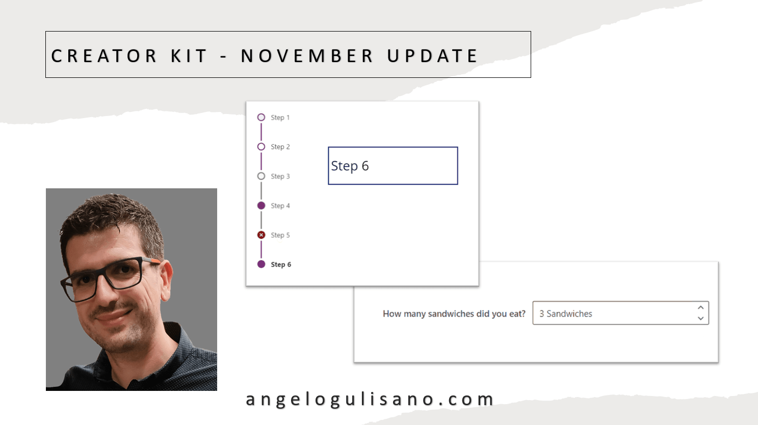
Creator Kit - November Update
Technical article about Creator Kit - November Update
app-canvas
applications-style
business-app
canvas-app
creator-kit-update
look-feel
news
power-apps
3 min read
Technical article about Creator Kit - November Update
Let’s see what news are introduced with november update of creator kit. If you don’t know what Creator Kit is, you can read my article here.
Have been introduced 2 new (in preview) components, SubwayNav and SpinButton:
Image not available - SubwayNav Control
SubwayNav Control
Image not available - SpinButton Control
SpinButton Control
Let’s see a basic introduction to use these controls.
You can use this control to show a wizard steps in our application. Let’s understand how can we use it. When you add it on your app, you should see something this:
Image not available - SubwayNav control
SubwayNav control
We should set some properties:
Set a Table , with these attributes:
ItemKey: Key of item
ItemLabel: A Display Name of item
ItemState: Icon of the step, it could be one of: “Current”, “Completed”, “Unsaved”, “ViewedNotCompleted”, “Error” , “WizardComplete”
Accourding to source code, try to put this on Items propertie:
Table(
    {
        ItemKey: "1",
        ItemLabel: "Step 1",
        ItemState: "Current"
    },
    {
        ItemKey: "2",
        ItemLabel: "Step 2",
        ItemState: "Completed"
    },
    {
        ItemKey: "3",
        ItemLabel: "Step 3",
        ItemState: "Unsaved"
    },
    {
        ItemKey: "4",
        ItemLabel: "Step 4",
        ItemState: "ViewedNotCompleted"
    },
    {
        ItemKey: "5",
        ItemLabel: "Step 5",
        ItemState: "Error"
    },
    {
        ItemKey: "6",
        ItemLabel: "Step 6",
        ItemState: "WizardComplete"
    }
)
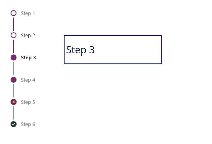
You should see this result:
Image not available - Steps example
Steps
If you don’t want specify ItemState , you can set empty string (ItemState: “”) , and you’ll see an empty white dot.
You can use OnSelect to get selected item and change page to show next step of your wizard. Just to understand , in this case I saved selected step on variable (Is just an example, you can use Controlname.Selected insted):
UpdateContext({SeletectStep: Self.Selected})
And on label:
SeletectStep.ItemLabel
Results:
Other useful properties are:
Theme : Property to set Json theme on controls, as you can see also in others controls of creator Kit. I usually set it when my application starts, and set it on all controls of Creator Kit who support it.
Subway Nav State: Property to set state on entire controls. You can choose from: “None”, “Errors”, “WizardComplete”
Image not available - Example of set Subway Nave state property to “WizardComplete”
Example of set Subway Nave state property to “WizardComplete”
A spin button is control to allow to add number in small steps. When you add control you should see this:
Image not available - SpinButton control
SpinButton
Principal properties:
Label: Usefull to show a label of control.
Suffix: To add suffix after value.
Theme: As usual, Json theme.
Min: Minimal value to set.
Max: Maximun value to set.
Step: Value to add or Subtracts.
Le’t see an example, I set these properties:
Image not available - SpinButton properties
Properties
Image not available - SpinButton demo (animated GIF)
Results
About esixting control, have been added:
Tooltip for Icon component.
DelayOutput for SearchBox component.
I hope these information can help you…Here you can find official release page on GitHub for this update.
Contact me for questions! Have a nice day!