At the time of writing this article, when you add Library Component of Creator Kit, you may find some errors. If you don’t know what Creator Kit is, you can read my article here.
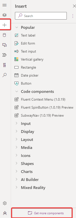
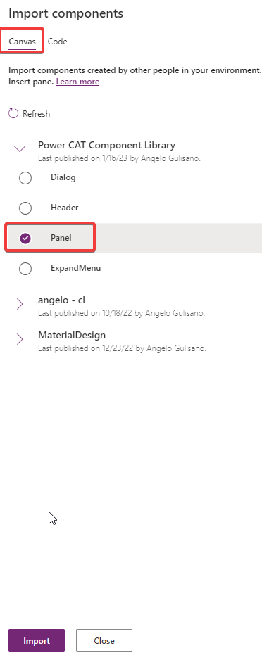
Add control to your App
Add one of Library control to your app. If you didn’t have installed Creator Kit in your environment, you can read this article to do it.
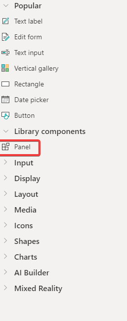
Let’s see how to use this control.
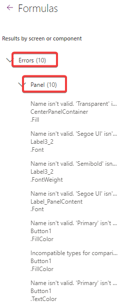
Errors
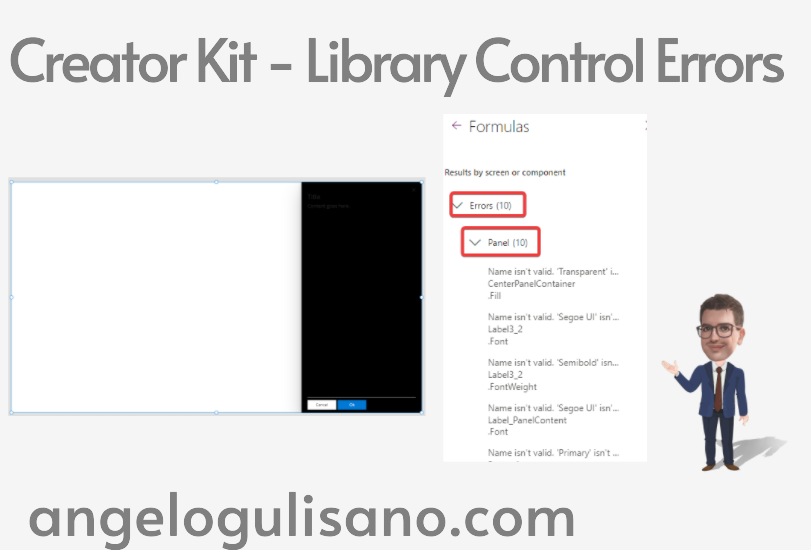
As you can see, now you have 10 errors on your app. All errors are relative to our Panel Control:
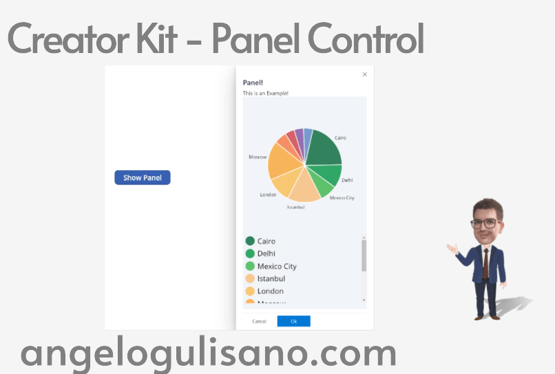
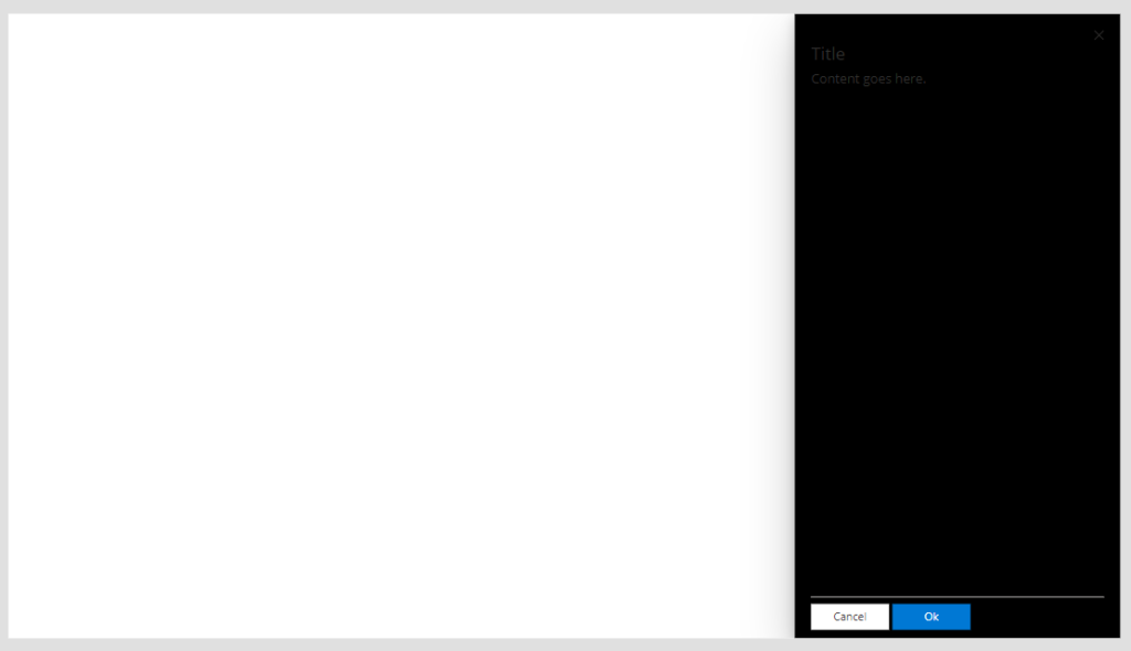
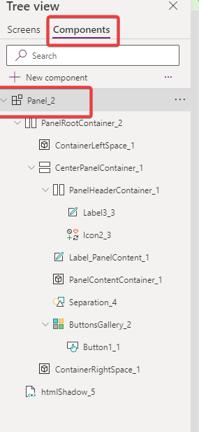
Our control should look like this:
How to fix it
To fix, you should follow these step:
- Create a local copy of your control
- Fix errors
- Use copied control
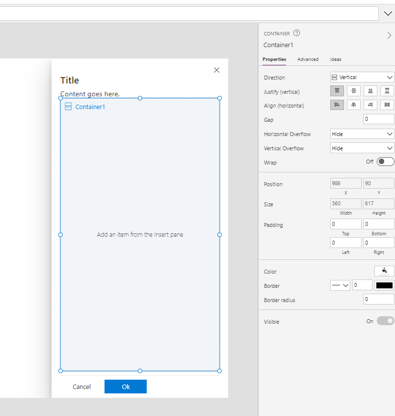
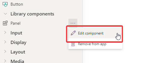
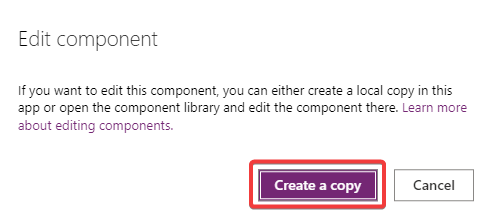
Let’s start to create local copy. Click on Edit and then Create Copy:
Now you have local copy and you can fix errors:
In this case (But the errors will change depending on the control you have), I fixed:
Button:
If(ThisItem.ButtonType = Primary, ColorValue(Panel_2.Theme.palette.themePrimary))To
If(ThisItem.ButtonType = 'Microsoft.CoreControls.Button.ButtonType'.Standard, ColorValue(Panel_2.Theme.palette.themeDark))Font:
'Segoe UI'To
Font.'Segoe UI'SemiboldTo
FontWeight.SemiboldTransparentColor.TransparentNow your control should work. You should see like this:
We can use our version of control:
Considerations
I hope these information can help you…Here you can find official documentations on GitHub for this control.
Contact me for questions! Have a nice day!