
Today , we’re introducing one of the menu & nav controls group of Creator Kit: “Nav Control“. Let’s see What is it and how it works. If you don’t know what Creator Kit is, you can read my article here.
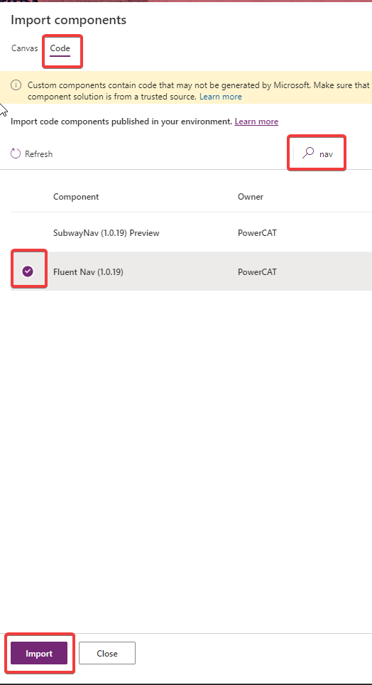
Add control to your App
Before use it, you should add it to your app. If you didn’t have installed Creator Kit in your environment, you can read this article to do it.
Let’s see how to use this control.
Nav Control
You can use this control to create a navigation menu in your app. Let’s understand how can we use it. When you add it on your app, you should see something this:
We should set some properties:
Items
Create Table with these attributes:
- ItemDisplayName – The Display Name of the menu item
- ItemKey – The key of item (must be unique)
- ItemEnabled – (Default true) Set to false to disabled
- ItemVisible – (Default true) Set to false to hide
- ItemIconName – The Fluent UI icon to use (here you can find icons)
- ItemIconColor – The color to render the icon as (e.g. named, rgb or hex value)
- ItemIconOnly – (Default false) set true to hide text label
- ItemParentKey – Render the option as child item of another option
- ItemExpanded – Set to false or true if the group should remain collapsed or expanded respectively.
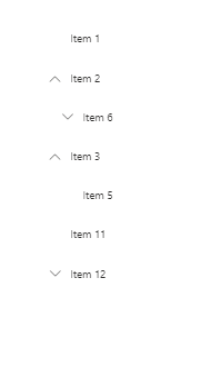
Accourding to documentation, try to put this on Items properties:
Table(
{
ItemKey: "1",
ItemDisplayName: "Home",
ItemIconName: "Home",
ItemIconColor: "Green"
},
{
ItemKey: "2",
ItemDisplayName: "Customer",
ItemIconName: "People",
ItemIconColor: "Red"
},
{
ItemKey: "3",
ItemDisplayName: "Documents",
ItemIconName: "People",
ItemIconColor: "Grey"
},
{
ItemKey: "4",
ItemDisplayName: "Others",
ItemIconName: "DocumentSet",
ItemIconColor: "Grey"
},
{
ItemKey: "5",
ItemDisplayName: "Quick Reference Guide",
ItemParentKey: "4",
ItemIconName: "Info",
ItemIconColor: "Grey"
}
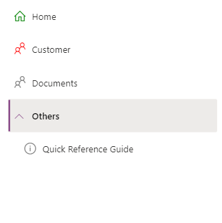
)You should see this result:
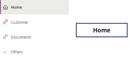
OnSelect
You can use OnSelect to get selected item and do some actions like change page. As usual, Just to understand , I show selected item display name in a label:
NavMenu.Selected.ItemDisplayNameResults:
Others useful properties are:
- Theme : Property to set Json theme on controls, as you can see also in others controls of creator Kit. I usually set it when my application starts, and set it on all controls of Creator Kit who support it. You can create your theme here.
- CollapseByDefault: You can set to True or False. Nav remain collapsed or expanded respectively. Individual Item level expand property is respected.
Considerations
I hope these information can help you…Here you can find official documentations on GitHub for this control.
Contact me for questions! Have a nice day!