In this article, let’s see how we can work with JSON format in our Canvas App.
What JSON is?
JavaScript Object Notation (JSON) is a lightweight format for exchanging data. It is based on JavaScript syntax, but is language independent and is commonly used for the transmission of structured data.
JSON’s foundation is two structures:
- A collection of name/value pairs
- An ordered list of values
These universal structures make JSON versatile across programming paradigms. It represents data as key/value pairs with keys as strings and values as various data types.
Feel free to write me if you need help.
JSON in Canvas App
Incorporate the JSON() function into your applications to seamlessly transform your data into JSON format, and employ the ParseJSON() function to convert a string, provided it is formatted in JSON, into a usable object.
- JSON( DataStructure [, Format ] )
- DataStructure – Required. The data structure to convert to JSON. Tables, records, and primitive values are supported, arbitrarily nested.
- Format – Optional. JSONFormat enum value. The default value is JSONFormat.Compact, which doesn’t add newlines or spaces and blocks binary data and unsupported columns.
- ParseJSON( JSONString )
- JSONString – Required. The JSON structure represented as text.
JSON format example:
{
  "title": "The Lord of the Rings",
  "author": "J.R.R. Tolkien",
  "publication_year": 1954,
  "genre": ["Fantasy", "Adventure"],
  "publisher": {
    "name": "Mondadori",
    "location": "Milan, Italy"
  },
  "price": 20.99,
  "available": true
}
From Data to JSON
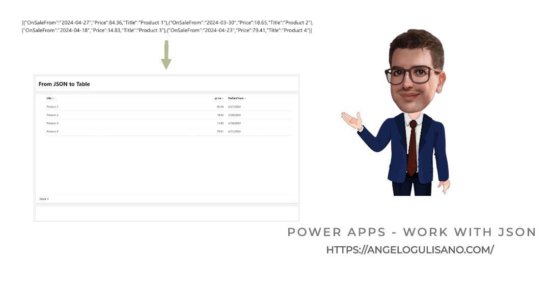
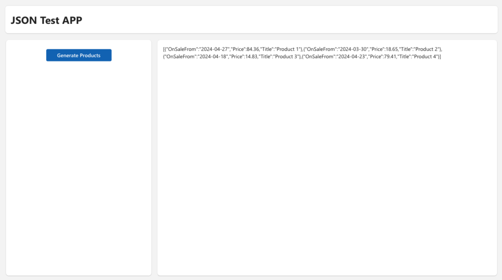
Let’s explore how these functions work in Power Apps. First, we’re going to create a collection with random data.
ClearCollect(
    collProducts,
    {
        Title: "Product 1",
        Price: Round(
            Rand() * 100,
            2
        ),
        OnSaleFrom: DateAdd(
            Today(),
            -Rand() * 30,
            TimeUnit.Days
        )
    },
    {
        Title: "Product 2",
        Price: Round(
            Rand() * 100,
            2
        ),
        OnSaleFrom: DateAdd(
            Today(),
            -Rand() * 30,
            TimeUnit.Days
        )
    },
    {
        Title: "Product 3",
        Price: Round(
            Rand() * 100,
            2
        ),
        OnSaleFrom: DateAdd(
            Today(),
            -Rand() * 30,
            TimeUnit.Days
        )
    },
    {
        Title: "Product 4",
        Price: Round(
            Rand() * 100,
            2
        ),
        OnSaleFrom: DateAdd(
            Today(),
            -Rand() * 30,
            TimeUnit.Days
        )
    }
)
And store into variabile in JSON Format:
UpdateContext({ctxJSONData: JSON(collProducts)})Result:
Consider “Format” parameter of JSON formula:
- JSONFormat.Compact: Output is compact with no added spaces or newlines.
- JSONFormat.FlattenValueTables: Flatten Power Fx Value tables to JSON friendly arrays.
- JSONFormat.IndentFour: Output contains newlines and four-space indentation for readability.
- JSONFormat.IncludeBinaryData: Result includes image, video, and audio-clip columns.
- JSONFormat.IgnoreBinaryData: Result excludes image, video, or audio-clip columns.
- JSONFormat.IgnoreUnsupportedTypes: Allows unsupported data types but excludes them from the result.
Keep in mind that if your data includes a type that is not supported, you should utilize the IgnoreUnsupportedTypes option to avoid errors. For a list of supported data types, please consult this resource.
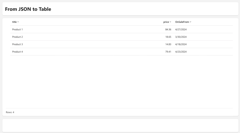
From JSON to Text
Let’s assume that we’ve securely stored our JSON data in our data repository. In this example, I’ll demonstrate how to transfer textual data to a different screen. However, in real-world scenarios, I’ve stored JSON data within a text column on SharePoint. Now, we aim to convert text to JSON to display the record in a table.
Navigate(
    'screen Data',
    Transition.None,
    {data: ctxJSONData}
)
During the “OnVisible” event, our task is to transform JSON text into a structured object. To accomplish this, we need to loop through (using ForAll) each record within our Parsed JSON data, then systematically access fields within the untyped object and cast them into identifiable types.
UpdateContext(
    {
        ctxResult: ForAll(
            ParseJSON(data),
            {
                title: Text(ThisRecord.Title),
                price: Value(ThisRecord.Price),
                OnSaleFrom: DateValue(ThisRecord.OnSaleFrom)
            }
        )
    }
)
See official documentations:
How did I use this feature?
I developed a true custom application for a client designed to simplify the management of corporate travel requests. In this scenario, my client is presented with a plethora of options to select when planning a trip. To efficiently manage the many choices, I chose to use a single text field in my database to store a JSON text containing all the selected options. This approach eliminated the need to create more than 25 individual fields. I was able to use this mode since none of these 25 fields were needed for me to thread travel requests.
Considerations
I hope these information can help you! Leave me a comment to let me know what you think, or if you have a better idea to handle this case.
Contact me for questions! Have a nice day!