Let’s see what news are introduced with november update of creator kit. If you don’t know what Creator Kit is, you can read my article here.
New Features
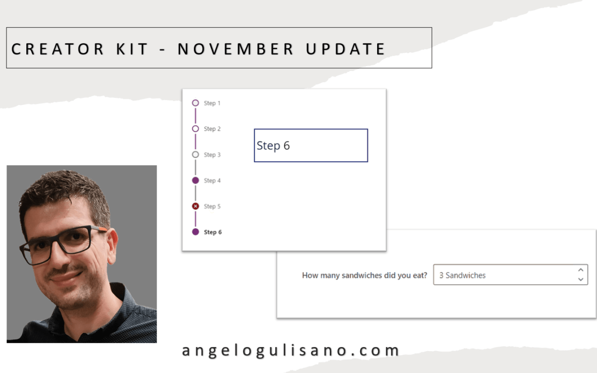
Have been introduced 2 new (in preview) components, SubwayNav and SpinButton:
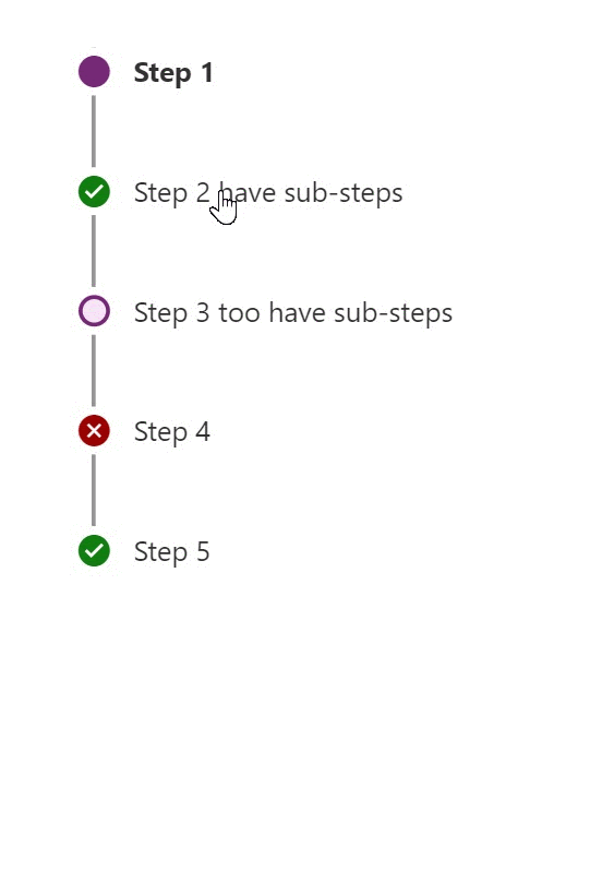
SubwayNav Control

SpinButton Control
Let’s see a basic introduction to use these controls.
SubwayNav
You can use this control to show a wizard steps in our application. Let’s understand how can we use it. When you add it on your app, you should see something this:
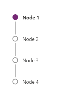
We should set some properties:
Items
Set a Table , with these attributes:
- ItemKey: Key of item
- ItemLabel: A Display Name of item
- ItemState: Icon of the step, it could be one of: “Current”, “Completed”, “Unsaved”, “ViewedNotCompleted”, “Error” , “WizardComplete”
Accourding to source code, try to put this on Items propertie:
Table(
    {
        ItemKey: "1",
        ItemLabel: "Step 1",
        ItemState: "Current"
    },
    {
        ItemKey: "2",
        ItemLabel: "Step 2",
        ItemState: "Completed"
    },
    {
        ItemKey: "3",
        ItemLabel: "Step 3",
        ItemState: "Unsaved"
    },
    {
        ItemKey: "4",
        ItemLabel: "Step 4",
        ItemState: "ViewedNotCompleted"
    },
    {
        ItemKey: "5",
        ItemLabel: "Step 5",
        ItemState: "Error"
    },
    {
        ItemKey: "6",
        ItemLabel: "Step 6",
        ItemState: "WizardComplete"
    }
)
You should see this result:
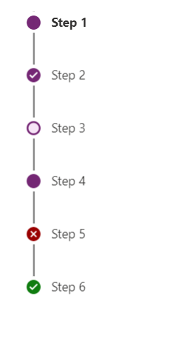
If you don’t want specify ItemState , you can set empty string (ItemState: “”) , and you’ll see an empty white dot.
OnSelect
You can use OnSelect to get selected item and change page to show next step of your wizard. Just to understand , in this case I saved selected step on variable (Is just an example, you can use Controlname.Selected insted):
UpdateContext({SeletectStep: Self.Selected})And on label:
SeletectStep.ItemLabelResults:
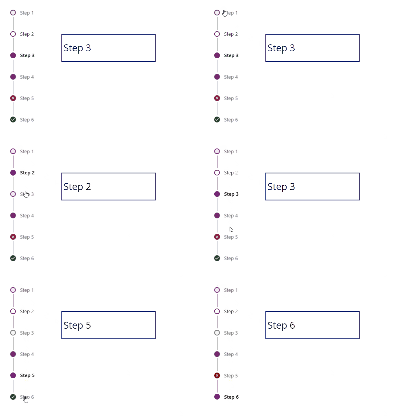
Other useful properties are:
- Theme : Property to set Json theme on controls, as you can see also in others controls of creator Kit. I usually set it when my application starts, and set it on all controls of Creator Kit who support it.
- Subway Nav State: Property to set state on entire controls. You can choose from: “None”, “Errors”, “WizardComplete”
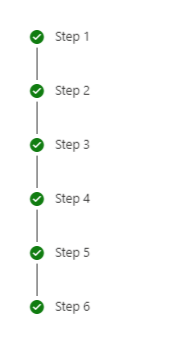
SpinButton
A spin button is control to allow to add number in small steps. When you add control you should see this:
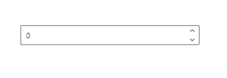
Principal properties:
- Label: Usefull to show a label of control.
- Suffix: To add suffix after value.
- Theme: As usual, Json theme.
- Min: Minimal value to set.
- Max: Maximun value to set.
- Step: Value to add or Subtracts.
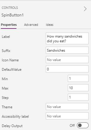
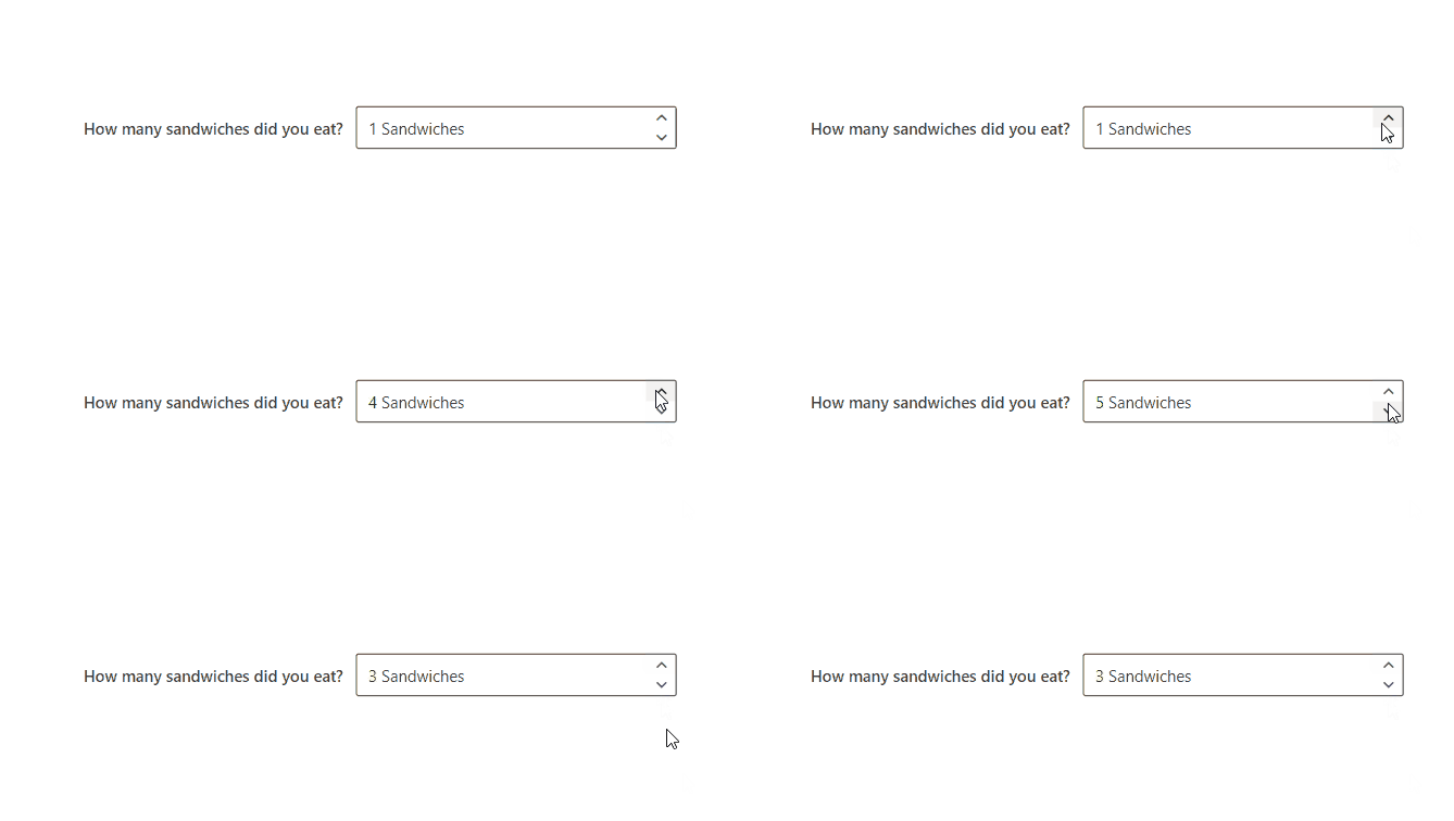
Le’t see an example, I set these properties:
New Features for Existing Components
About esixting control, have been added:
- Tooltip for Icon component.
- DelayOutput for SearchBox component.
Considerations
I hope these information can help you…Here you can find official release page on GitHub for this update.
Contact me for questions! Have a nice day!


