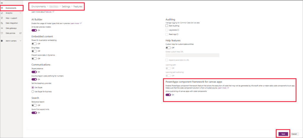
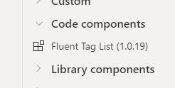
At the time of writing this article, when you add Library Component of Creator Kit, you may find some errors. If you don’t know what Creator Kit is, you can read my article here.
Add control to your App
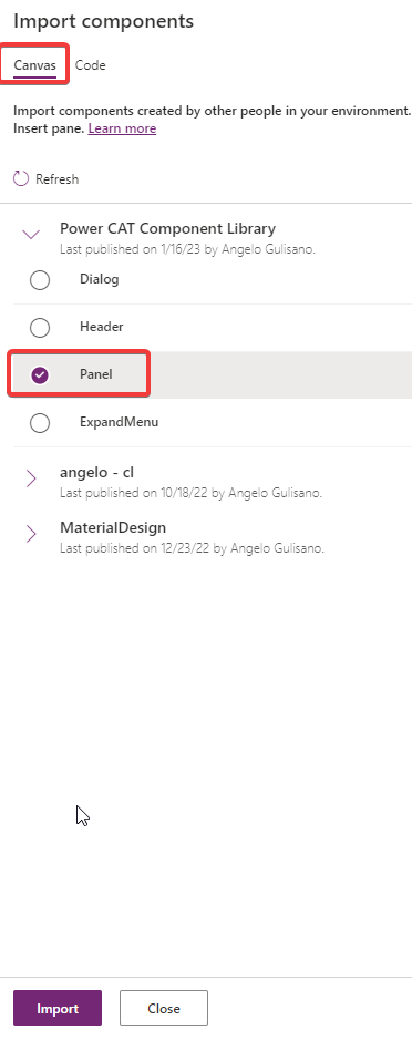
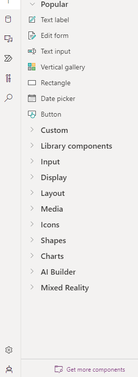
Add one of Library control to your app. If you didn’t have installed Creator Kit in your environment, you can read this article to do it.
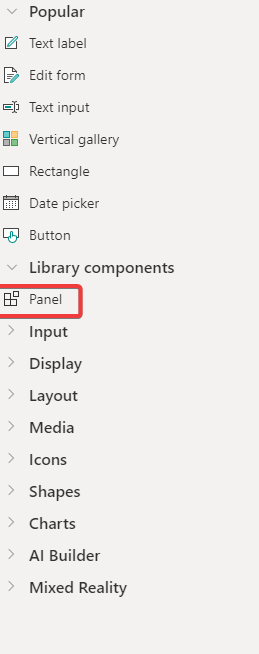
Add Panel Component
Add Control To App
Let’s see how to use this control.
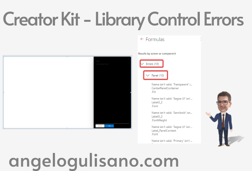
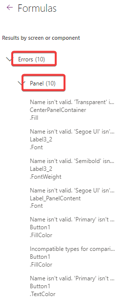
Errors
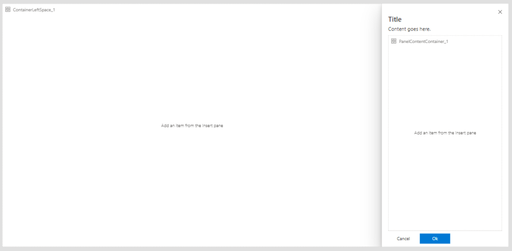
As you can see, now you have 10 errors on your app. All errors are relative to our Panel Control:
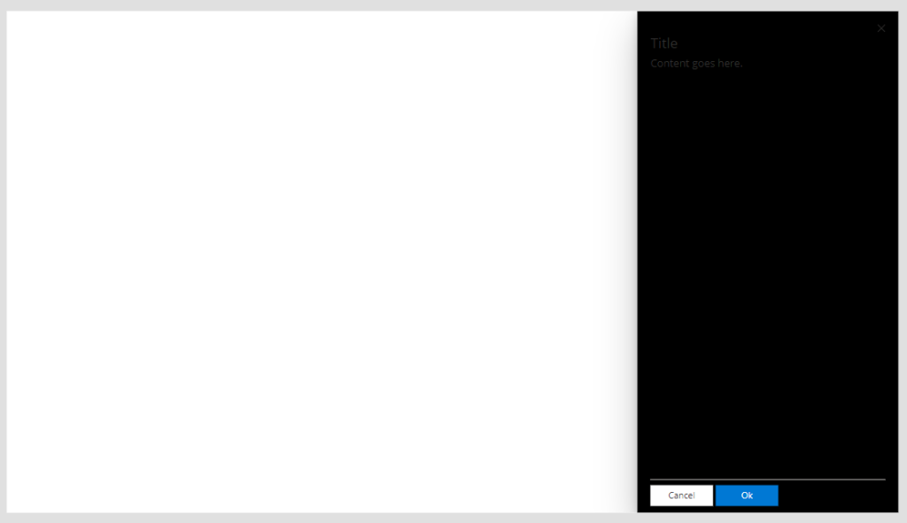
Our control should look like this:
Panel
How to fix it
To fix, you should follow these step:
Create a local copy of your control
Fix errors
Use copied control
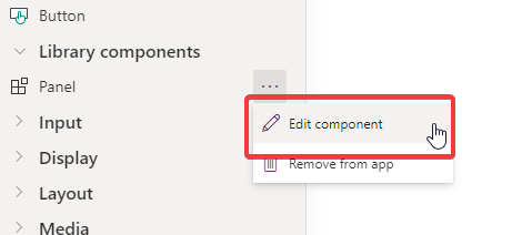
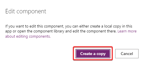
Let’s start to create local copy. Click on Edit and then Create Copy:
Edit component
Create copy
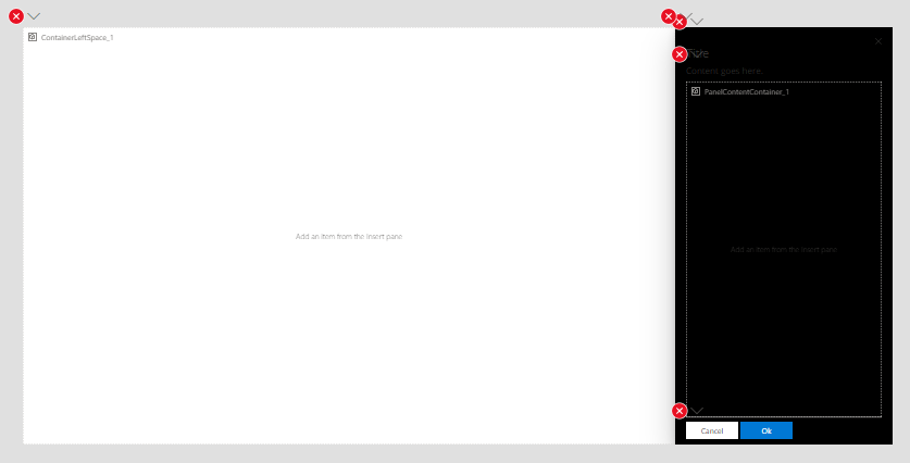
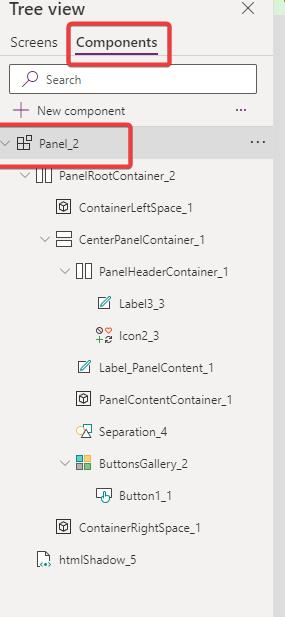
Now you have local copy and you can fix errors:
Control to fix
In this case (But the errors will change depending on the control you have), I fixed:
Today , we’re introducing one of the “Surface” controls group of Creator Kit: “Panel Control“. Let’s see What is it and how it works. If you don’t know what Creator Kit is, you can read my article here.
Add control to your App
Before use it, you should add it to your app. If you didn’t have installed Creator Kit in your environment, you can read this article to do it.
Add Control to your App
Add Panel Component
Let’s see how to use this control.
Panel Control
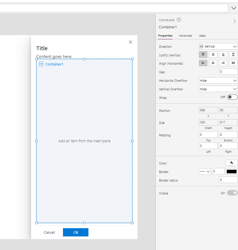
This control is usefull to create complex creation, edit, or management experiences of items or settings. Let’s understand how can we use it. When you add it on your app, you should see something this:
Position– (Default Right”) You can write “Left” if you want left panel
Visible– True or False, to show or hide panel. I usually use a local variable to show or Hide it
Buttons– Table to define buttons of your panel
OnButtonSelect– Event to manage select event of your button
Theme : Property to set Json theme on controls, as you can see also in others controls of creator Kit. I usually set it when my application starts, and set it on all controls of Creator Kit who support it. You can create your theme here.
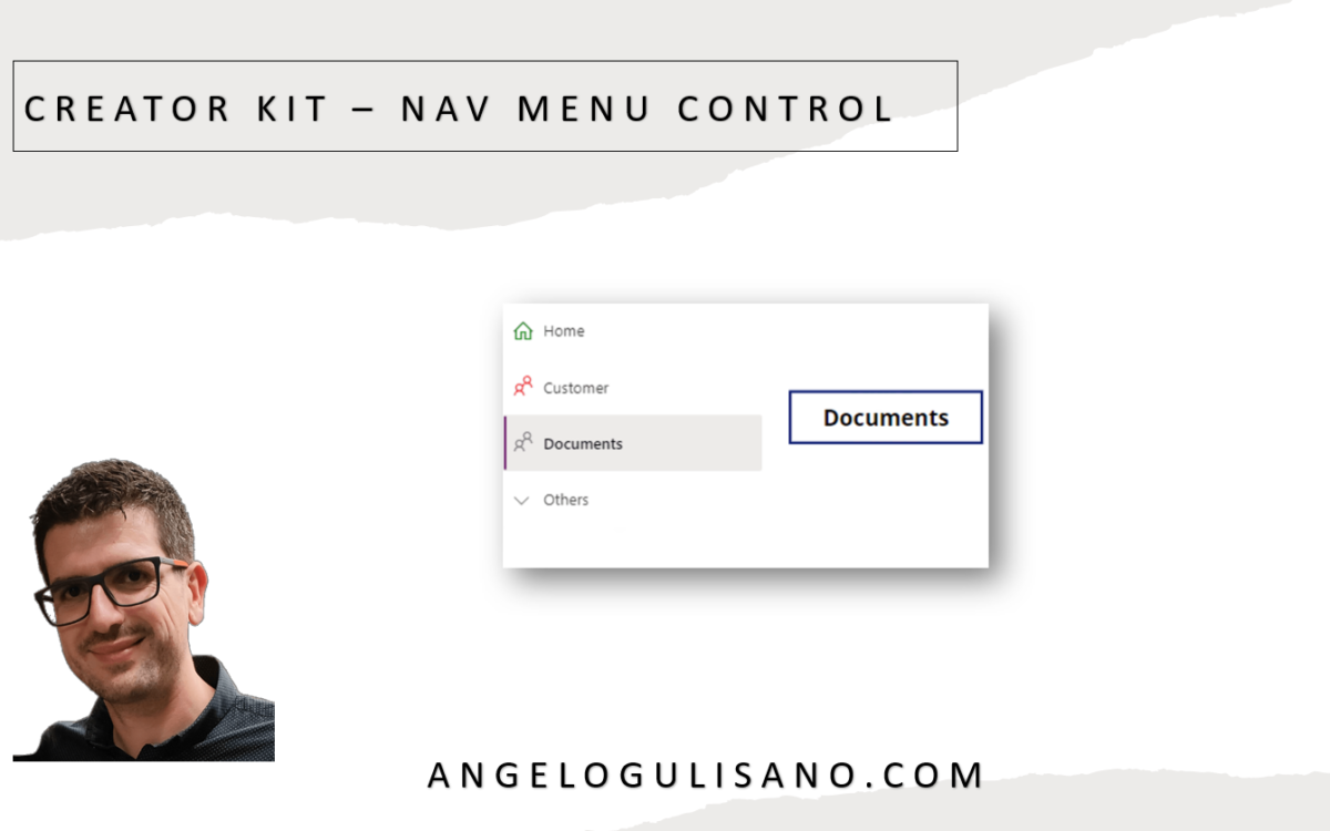
Today , we’re introducing one of the menu & nav controls group of Creator Kit: “Nav Control“. Let’s see What is it and how it works. If you don’t know what Creator Kit is, you can read my article here.
Add control to your App
Before use it, you should add it to your app. If you didn’t have installed Creator Kit in your environment, you can read this article to do it.
Add Control to your App
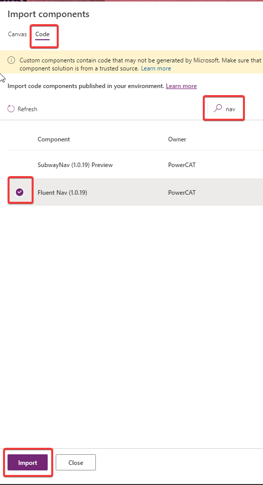
Add Fluent Nav Control
Let’s see how to use this control.
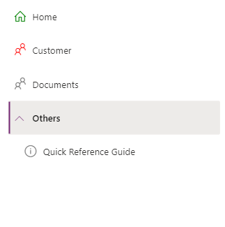
Nav Control
You can use this control to create a navigation menu in your app. Let’s understand how can we use it. When you add it on your app, you should see something this:
Nav Control
We should set some properties:
Items
Create Table with these attributes:
ItemDisplayName – The Display Name of the menu item
ItemKey – The key of item (must be unique)
ItemEnabled – (Default true) Set to false to disabled
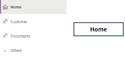
You can use OnSelect to get selected item and do some actions like change page. As usual, Just to understand , I show selected item display name in a label:
NavMenu.Selected.ItemDisplayName
Results:
Nav Menu
Others useful properties are:
Theme : Property to set Json theme on controls, as you can see also in others controls of creator Kit. I usually set it when my application starts, and set it on all controls of Creator Kit who support it. You can create your theme here.
CollapseByDefault: You can set to True or False. Nav remain collapsed or expanded respectively. Individual Item level expand property is respected.
Let’s see what news are introduced with november update of creator kit. If you don’t know what Creator Kit is, you can read my article here.
New Features
Have been introduced 2 new (in preview) components, SubwayNav and SpinButton:
SubwayNav Control
SpinButton Control
Let’s see a basic introduction to use these controls.
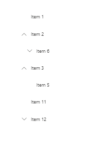
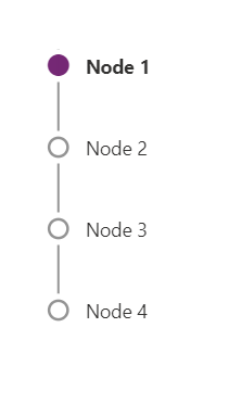
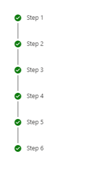
SubwayNav
You can use this control to show a wizard steps in our application. Let’s understand how can we use it. When you add it on your app, you should see something this:
SubwayNav control
We should set some properties:
Items
Set a Table , with these attributes:
ItemKey: Key of item
ItemLabel: A Display Name of item
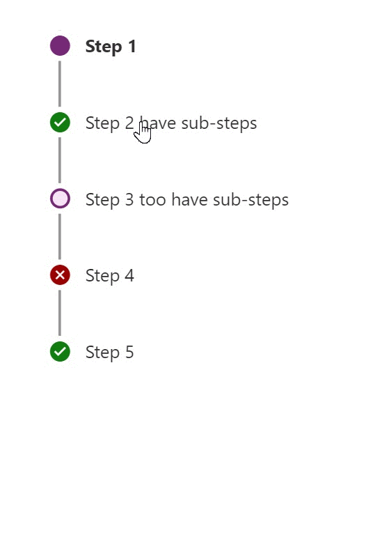
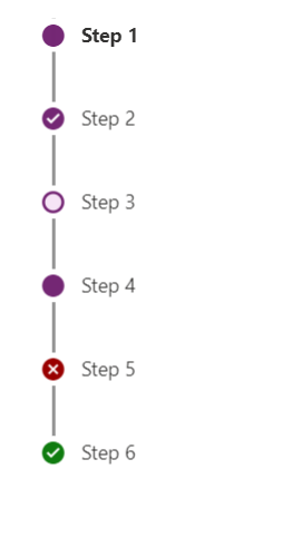
ItemState: Icon of the step, it could be one of: “Current”, “Completed”, “Unsaved”, “ViewedNotCompleted”, “Error” , “WizardComplete”
Accourding to source code, try to put this on Items propertie:
If you don’t want specify ItemState , you can set empty string (ItemState: “”) , and you’ll see an empty white dot.
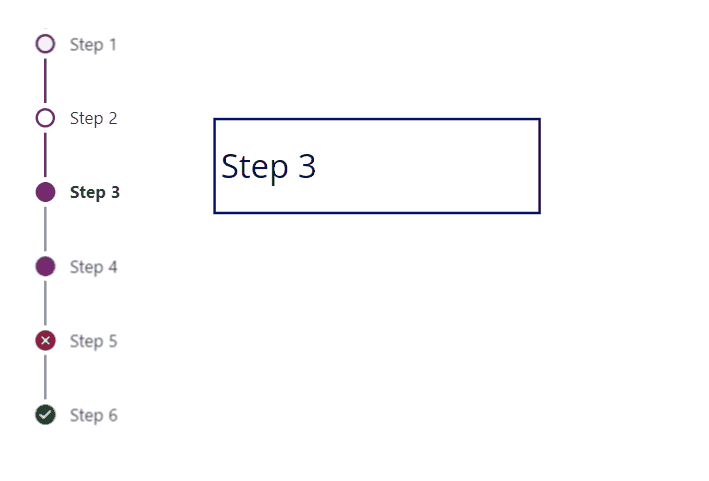
OnSelect
You can use OnSelect to get selected item and change page to show next step of your wizard. Just to understand , in this case I saved selected step on variable (Is just an example, you can use Controlname.Selected insted):
UpdateContext({SeletectStep: Self.Selected})
And on label:
SeletectStep.ItemLabel
Results:
Other useful properties are:
Theme : Property to set Json theme on controls, as you can see also in others controls of creator Kit. I usually set it when my application starts, and set it on all controls of Creator Kit who support it.
Subway Nav State: Property to set state on entire controls. You can choose from: “None”, “Errors”, “WizardComplete”
Example of set Subway Nave state property to “WizardComplete”
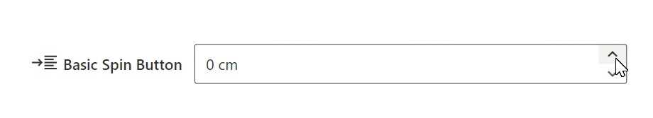
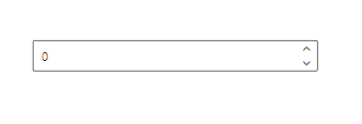
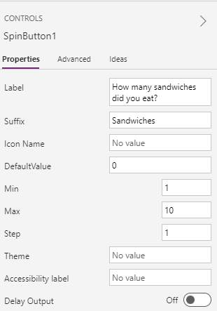
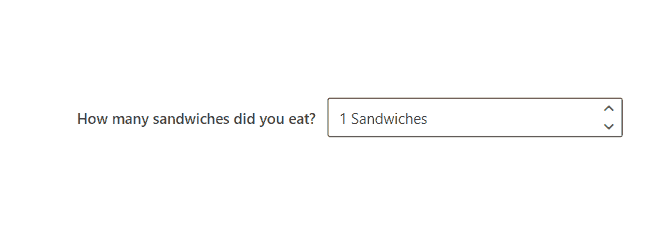
SpinButton
A spin button is control to allow to add number in small steps. When you add control you should see this:
Today, we’re going to speak about Creator Kit. With this fantastic tool, we have possibility to create Canvas App, with professional look & feel with “Microsoft 365” Style.
What is “Cretor Kit” ?
According to Microsoft , Creator Kit consist in a series of controls , utility and templates , created to increase developer productivity.
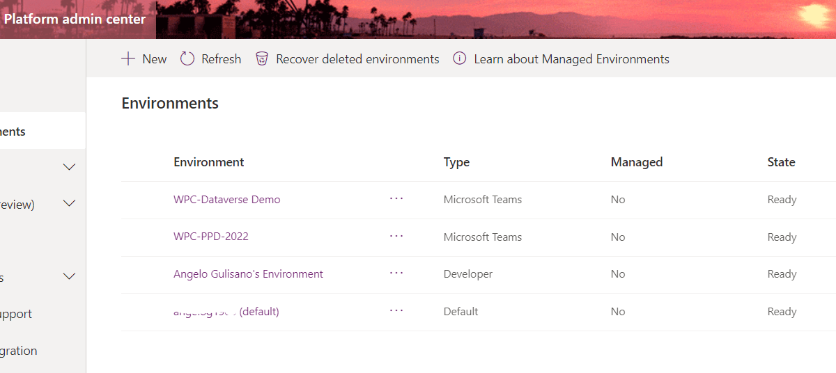
Today, we’re going to speak about Environment. Where people starting to create App or Flow, usually, use Default Environment. But in order to have correct governance or our Power Platform solutions, a good idea (but is not only the one) is create more then one Environment. For Example Dev, Quality and Prod.
What is an “Environment” ?
According to Microsoft , and Environment is a a space to store and share data, app , flows. You can image it as a “Container”.
Each environment can have a single Dataverse DB (but you can create environment withoud it)
Default environment is Shared by all users, in my opinion you shouldn’t use it to develop critical app.
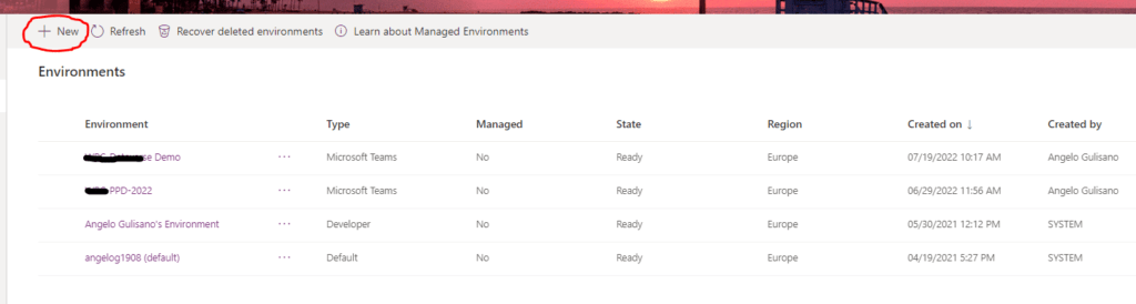
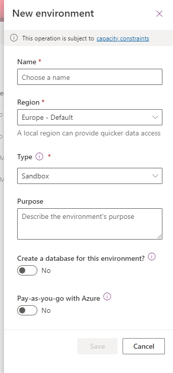
Environment types
Basically we can create 4 kinds of environment.
Sandbox: used for non-production environment but for developing and test. It can be reset or copy.
Production: used for permanent work. You need Power Apps license to create and manage it. It will provided with 1 GB database capacity.
Trial: used for short term testing. It will be cleaned automatically after 30 days. I usually use it to try new features. It can be create also as subscription based, and it can be conferted as production environment.
Hello, Today I want to explain how to improve performance of yours Canvas App. Any comments, integrations or suggestions are welcome 🙂
Cache local data
Does your data chanche during session of your app? If you reply “No”, you should store your data into local variable and get record from it, instead always ask to database.
SQL Server Delefation formulaSql Server Delegation Formula
Use Indexes Column
Simple, but people sometimes forgot to set indexes on column. For SQL Server and SharePoint, check wich columns you’re using to filter, and set Index on these columns.
When you want to create new record in your table you , tipically you use Default() function. When you use it, there is a call to your datasource …
Defaults(Projects_1)
And Idea is store result of this function on variable, and use it instead call Default() every time:
Set(
    newProject,
    Defaults(Projects_1)
);
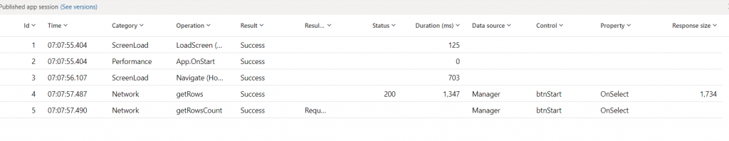
Debug – Monitoring Time
If you want to understand what happens “behind the scenes”, you should start a debugging session. From Power Apps portal, select your app and click Monitor:
Monitoring…
Now you can understand durations and respons size of your function to prevent performance issue.
Considerations
Check this official link for other tips .I hope this post was usefull for you.Leave me comment if you has appreciate it.
This website uses technical and profiling cookies. Clicking on "Accept" authorises all profiling cookies. Clicking on "Refuse" or the X will refuse all profiling cookies. By clicking on "Customise" you can select which profiling cookies to activate.
Google Analytics is a web analytics service provided by Google Ireland Limited ("Google"). Google uses the collected personal data to track and examine the usage of this website, compile reports on its activities, and share them with other Google services. Google may use your personal data to contextualize and personalize the ads of its advertising network. This integration of Google Analytics anonymizes your IP address.
Google reCAPTCHA is a SPAM protection service provided by Google Ireland Limited. The use of reCAPTCHA is subject to the Google privacy policy and terms of use.
